Hanging punctuation, and the margin nobody notices
A quotation mark at the start of a line makes the margin look dented. The fix is four hundred years old.
Letterforms, and the making of pages
A quotation mark at the start of a line makes the margin look dented. The fix is four hundred years old.
Medieval scribes placed a text block by drawing nine lines and reading the answer off the diagonals. No measuring, no arithmetic, no taste required — and the proportions that fall out are still the best default anybody has for a page of running text.
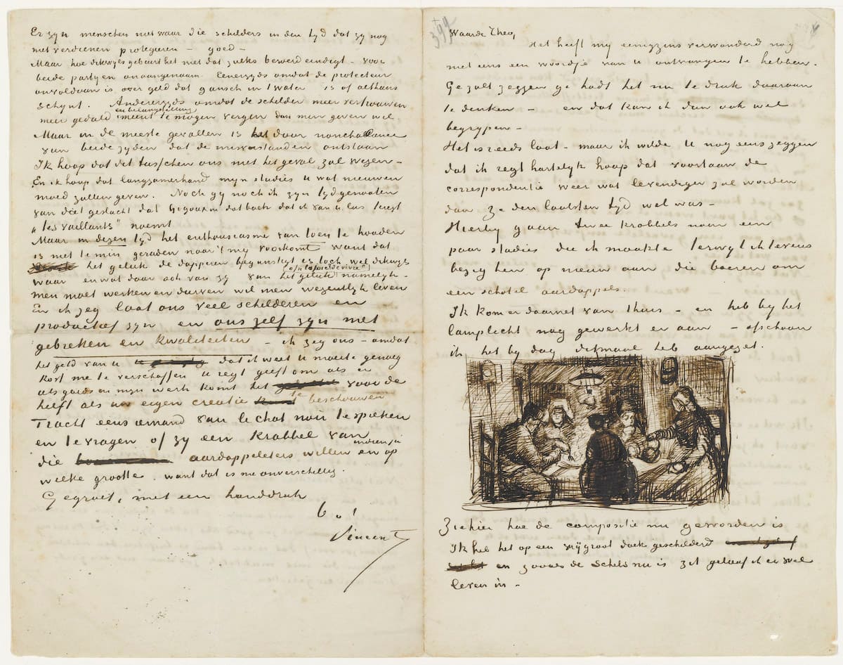
Over nine hundred of Van Gogh’s letters survive, and the famous ones are written with the same cut reed he drew with. They are the best free lesson in what a broad-edged tool does when nobody is performing: a working hand, at speed, on cheap paper.
拉丁字母的宽度各不相同,汉字却每一个都住在同样大的方框里。真正决定疏密的不是那个框,而是框里那一点留白——字面率。把中文和英文排在同一行时,出问题的几乎永远是这件事。
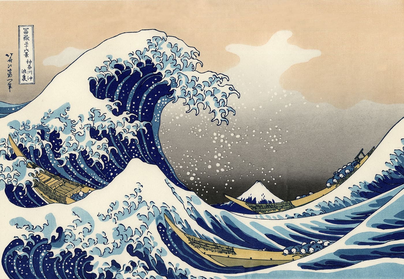
The Great Wave is not a painting. It is a print run — four trades, a dozen blocks, and a registration system made of two notches in the wood. Everything this series has said about presses, Edo said first with cherry planks.
Ogonek rośnie z litery, po tej samej krzywej, którą kończy się jej brzuszek. Przecinek doklejony pod spodem widać z drugiego końca pokoju — a przy ciasnej interlinii dotyka wersalika z następnego wiersza.
句読点や括弧は、字身の全部を使うわけではない。それでも全角の枠を持って歩くので、行の中に説明のつかない空きが生まれる。禁則処理と字詰めは、その空きをどう配るかという一つの問題の裏表である。
A caption and a headline want different letterforms, not the same letterform at two sizes. Foundries knew this when type was cut in metal, lost it when photocomposition arrived, and variable fonts have finally made it adjustable again.
한글은 낱자를 모아 한 글자를 만든다. 그래서 같은 크기라도 획이 들어찬 정도가 글자마다 크게 다르고, 라틴 알파벳에 맞춘 행간을 그대로 쓰면 페이지가 답답해진다.
A webfont is mostly glyphs your pages will never show — alphabets you do not write in, symbols nobody has typed since 1994. Cutting them is the largest single saving available to a text site, and the reader gives up nothing at all for it.
Háček nad malým písmenem se vejde. Nad velkým se nevejde nikdy, a počítat se s tím musí dřív, než se nastaví proklad — jinak se Ř z jednoho řádku dotkne účaří řádku nad ním.
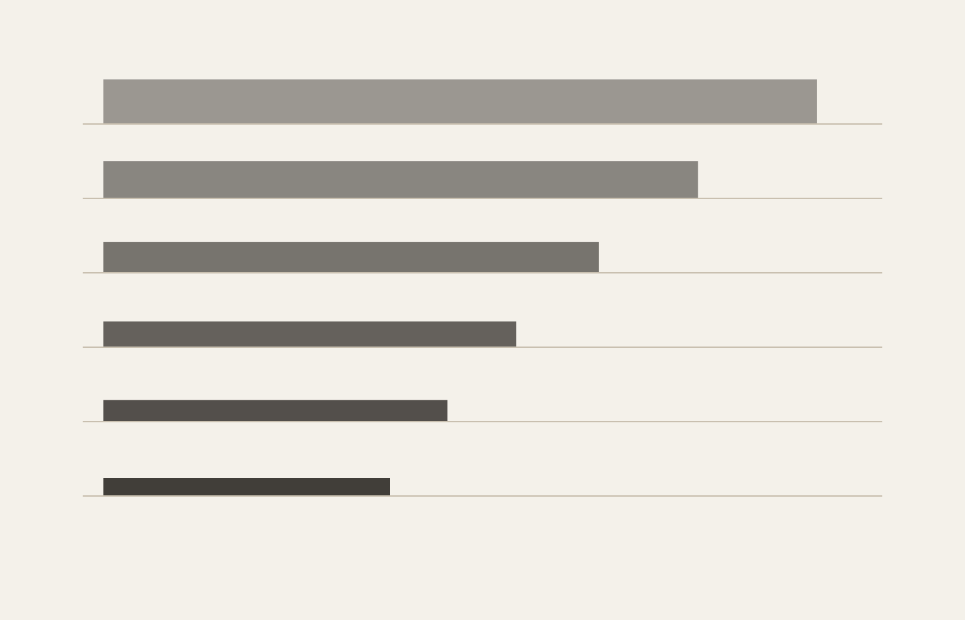
Nine roles, one ratio, and no size typed twice. Every measurement on the page comes from what a piece of text IS rather than from where it happens to sit, so one setting changes the whole page instead of one heading.
Türkçede i ve ı iki ayrı harftir, tıpkı o ile ö gibi. Yazılımın çoğu bunu bilmez, İstanbul’u ISTANBUL yapar, ve hatayı kimse bir veri tabanına yazılana kadar fark etmez.
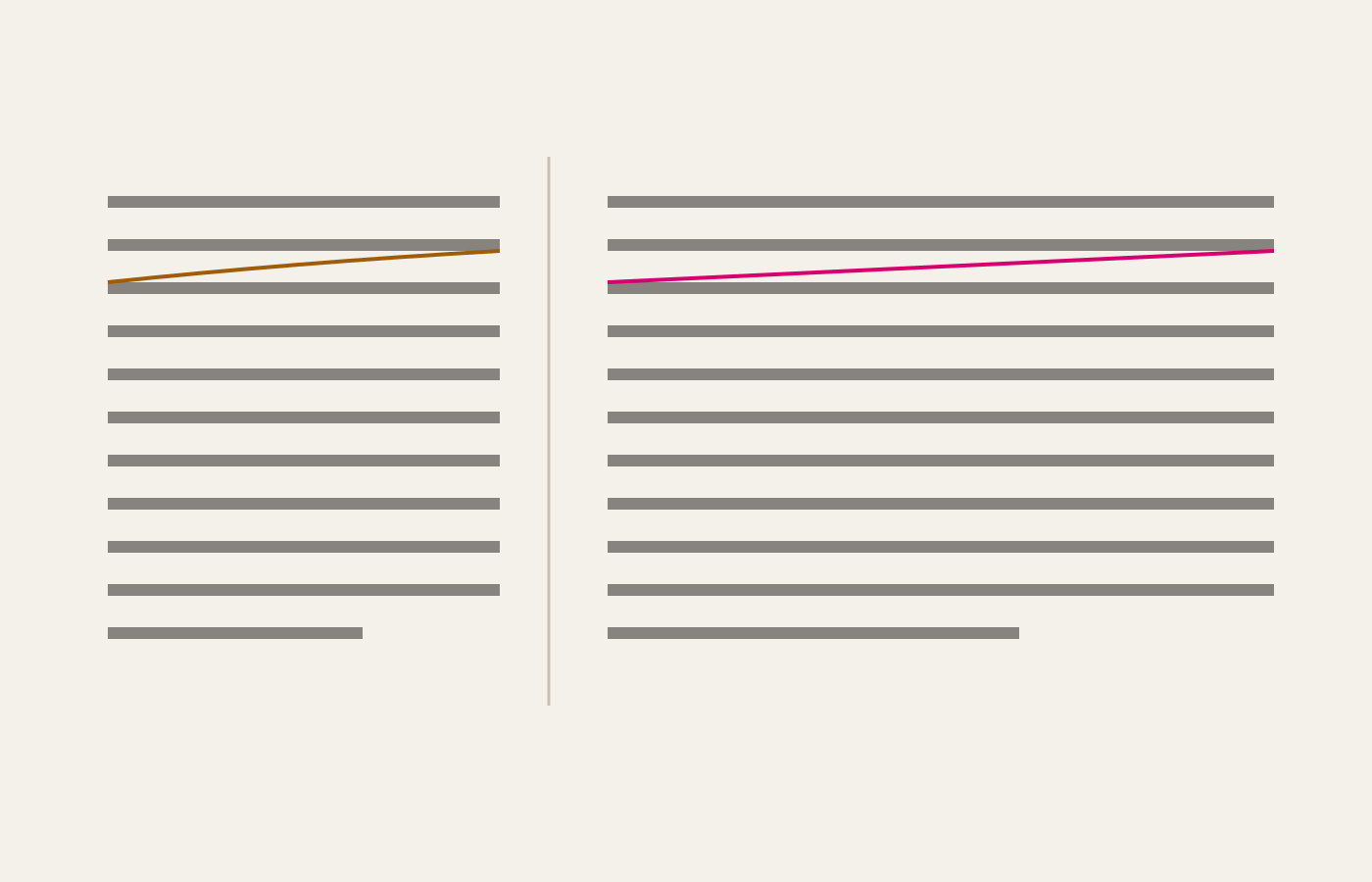
Sixty-six characters is not a superstition. It is the width at which the eye still finds the start of the next line without hunting for it, and it decides more about a reading page than the choice of typeface does.
Echte Kapitälchen sind gezeichnet: eigene Strichstärke, eigene Laufweite, eigene Höhe. Alles andere ist verkleinerte Versalschrift, wirkt dünn und zu eng — und genau das tut der Browser, wenn die Schrift den Schnitt nicht mitbringt.
Four horizontal marks that look alike, mean entirely different things, and are wrong on most pages on the web. A hyphen joins, an en dash spans, an em dash interrupts — and a minus sign is none of the three.
Þorn og eð stóðu einu sinni í ensku líka. Íslenskan hélt þeim, og prentsmiðjurnar borguðu fyrir það í heila öld — með stöfum sem þurfti að steypa sérstaklega og týndust jafnóðum úr kassanum.
Trois mots français pour trois choses que l’anglais confond sous le seul mot spacing. La chasse appartient à la lettre, l’approche au couple, le gris à la page entière — et l’un ne corrige jamais l’autre.
A highlighter is a reading tool, not a decoration. Five pigments, and which one you reach for is a claim about why the sentence matters: a definition, a warning and a number all want different colours.
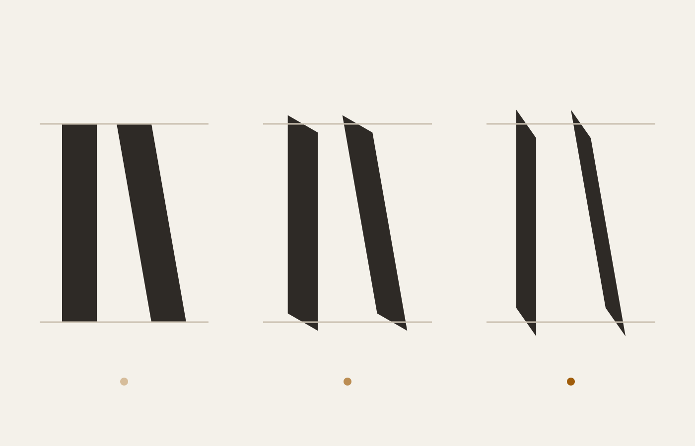
Nearly every serif on your screen is a frozen record of a flat nib held at an angle. Hold a pen at thirty degrees, write an O, and the thick and thin you get is the same modulation a type designer spends a year redrawing.
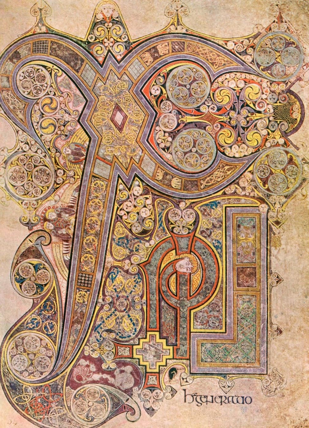
The roundest letters in the Latin tradition were written by scribes who had all the time in the world and no lower case to write with. What they left is a hand with almost no ascenders and a rhythm nothing since has matched.
The Renaissance hand that became our italic, reduced to four shapes and one angle. Ninety minutes gets you a legible page; the remaining decade is spent making it look easy.
A scribe ruled the page before writing a word, and the ruling was arithmetic: nib widths in, line height out. Every margin on this site comes from the same calculation, done by a stylesheet instead of a lead point.
Nét chữ đẹp không đến từ cổ tay. Nó đến từ chỗ người viết quyết định dừng lại, và từ nhịp thở giữa hai nét — thứ không cây bút nào dạy được cho người đang cầm nó.
Chữ Quốc ngữ chồng hai dấu lên cùng một nguyên âm: một dấu chất lượng, một dấu thanh. Đó là bài kiểm tra khắc nghiệt nhất cho khoảng cách dòng, và là lý do một trang tiếng Việt cần thoáng hơn tiếng Anh chừng hai phần mười.
Blocksatz ohne Silbentrennung ist der häufigste Satzfehler im Web: Löcher, die sich über drei Zeilen zu einem Bach zusammenschließen. Zu beheben ist er in einer einzigen CSS-Zeile, die fast niemand hinschreibt.
A measure, a leading and a typeface walk into a column, and only one of them ever gets blamed. Paper and screen do not disagree about type — they disagree about light, distance, and how long anybody will sit still.
Two paper systems, one of them measuring a quantity that changes depending on what the paper is for. Here is the conversion table, and the honest reason it can never be exact for every sheet on it.
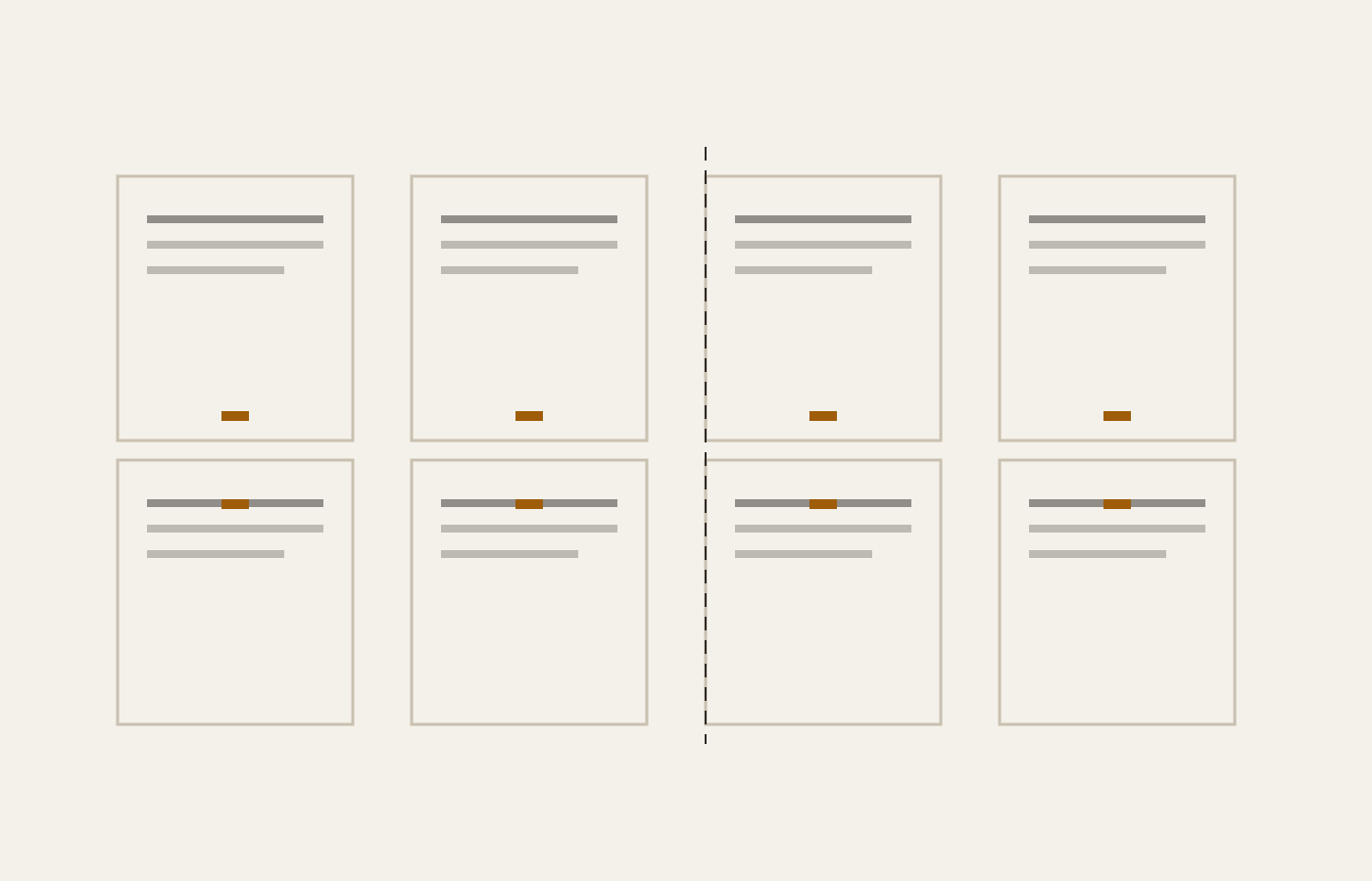
Fold a sheet three times and the page order stops being obvious — page one ends up beside page eight, upside down. Printers solved this before 1500, and every book you own is still assembled by their answer.
Two adjacent colours will not line up perfectly, not on any press ever built. Trapping is deciding in advance which one loses, and rich black is the same decision made about the darkest thing on the page.