The measure is the design
Sixty-six characters is not a superstition. It is the width at which the eye still finds the start of the next line without hunting for it, and it decides more about a reading page than the choice of typeface does.
Ask why a column is the width it is and you will usually be told about taste. It is not taste. It is the distance the eye can travel and still find the start of the next line without hunting for it.
The return sweep is the whole problem. At the end of a line the eye jumps left and down at the same time, and it lands by estimating. A short column gives it an easy target and a long one gives it a field of near-identical lines to choose from, which is why an over-wide measure makes people re-read the line they have just finished.
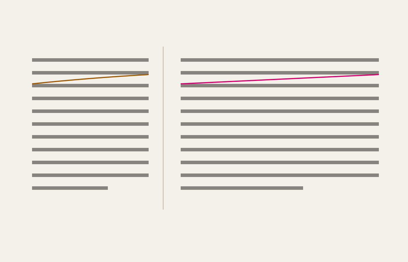
The number, and what it is really made of
Sixty-six characters per line is the figure everyone quotes, and it is a decent default. But characters are a proxy: what actually matters is the ratio between the line length and the size of the letters, so the same column that reads well at 18px reads badly at 13px, and a typeface with a large x-height wants a slightly shorter line than one with a small one.
Every writing system asks something different of a typeface, and the ones below ask it all at once:
Việt Nam — chữ Quốc ngữ chồng hai dấu lên một nguyên âm: nhoẻn, khuỷu, được.
Deutsch — Größe, Fußnote, Maßstab.
Polski — zażółć gęślą jaźń.
Čeština — příliš žluťoučký kůň úpěl ďábelské ódy.
Türkçe — ışık, İstanbul, yığın.
Íslenska — það þótti æði.
If the accents collide with the line above, the leading is too tight for the language, not for the typeface.
Every trade found the same number
The measure is one of the few typographic quantities that several industries converged on independently, each under different pressure, which is the strongest evidence available that it is a property of readers rather than of fashion:
| Setting | Typical measure | Why it landed there |
|---|---|---|
| Trade book | 60–70 chars | one column, held at arm's length |
| Newspaper column | 30–40 chars | scanned, not read; speed over comfort |
| Bible, two-column | 40–45 chars | thin paper, maximum words per spread |
| This site | 66 chars | a book page, on glass |
The newspaper row is the instructive one. Nobody reads a broadsheet line by line; the narrow column exists so the eye can drop vertically and sample. The moment the same text is meant to be read, the number doubles. A layout is a claim about how its text will be consumed, and the measure is where the claim is made.
What to do when the measure fights the page
Widen the leading before you widen the column. An extra tenth of a line height buys back a surprising amount of a long measure, because it makes the row the eye is returning to unambiguous.
And when a design insists on a wide column, break it. Two columns of 45 characters read faster than one of 90, which is why newspapers settled on narrow columns long before anybody measured why.