The measure is the design
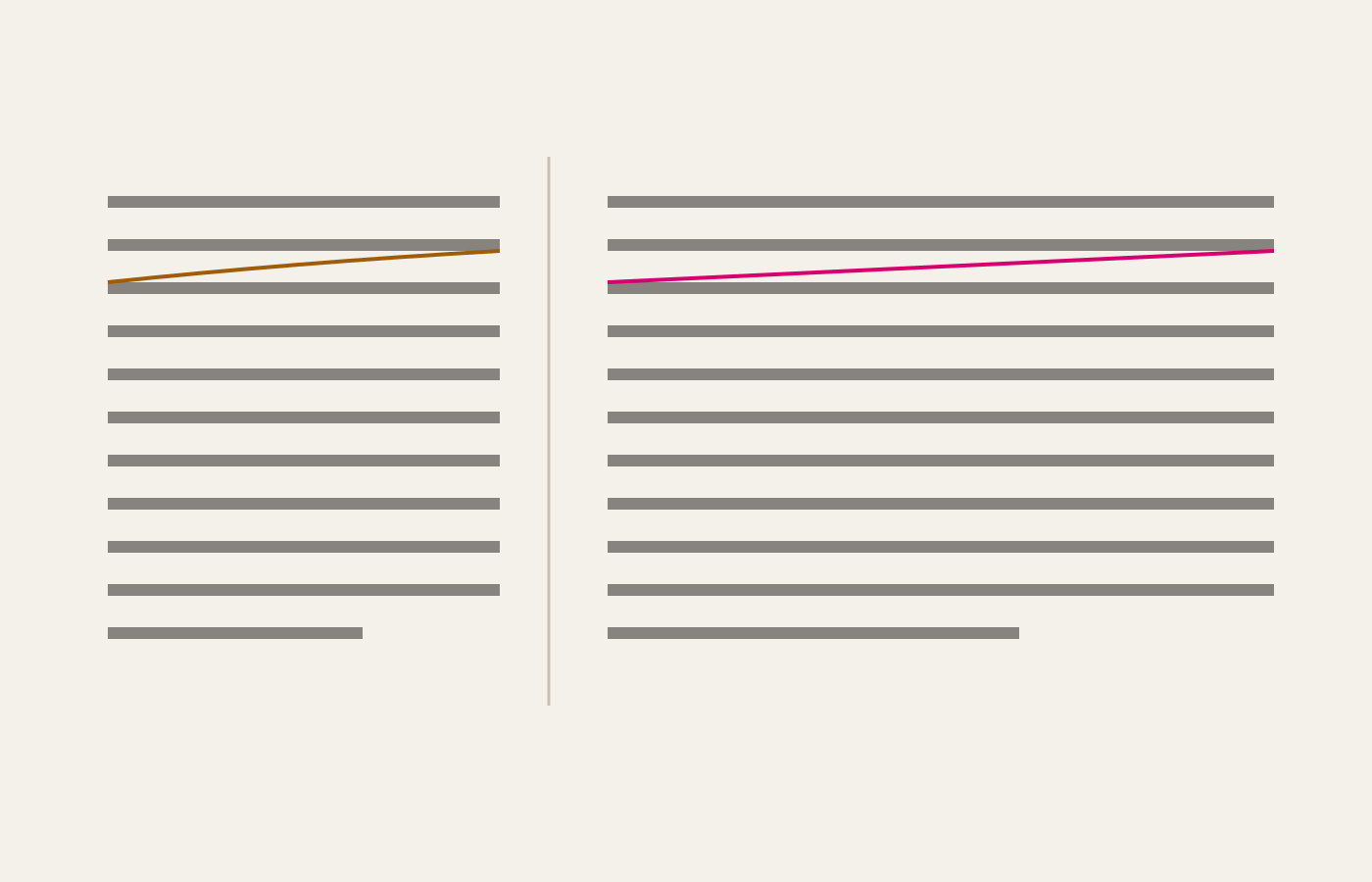
Sixty-six characters is not a superstition. It is the width at which the eye still finds the start of the next line without hunting for it, and it decides more about a reading page than the choice of typeface does.
Letterforms, and the making of pages
Sixty-six characters is not a superstition. It is the width at which the eye still finds the start of the next line without hunting for it, and it decides more about a reading page than the choice of typeface does.
A highlighter is a reading tool, not a decoration. Five pigments, and which one you reach for is a claim about why the sentence matters: a definition, a warning and a number all want different colours.
A measure, a leading and a typeface walk into a column, and only one of them ever gets blamed. Paper and screen do not disagree about type — they disagree about light, distance, and how long anybody will sit still.