Hanging punctuation, and the margin nobody notices
A quotation mark at the start of a line makes the margin look dented. The fix is four hundred years old.
Letterforms, and the making of pages
A quotation mark at the start of a line makes the margin look dented. The fix is four hundred years old.
Ogonek rośnie z litery, po tej samej krzywej, którą kończy się jej brzuszek. Przecinek doklejony pod spodem widać z drugiego końca pokoju — a przy ciasnej interlinii dotyka wersalika z następnego wiersza.
A caption and a headline want different letterforms, not the same letterform at two sizes. Foundries knew this when type was cut in metal, lost it when photocomposition arrived, and variable fonts have finally made it adjustable again.
A webfont is mostly glyphs your pages will never show — alphabets you do not write in, symbols nobody has typed since 1994. Cutting them is the largest single saving available to a text site, and the reader gives up nothing at all for it.
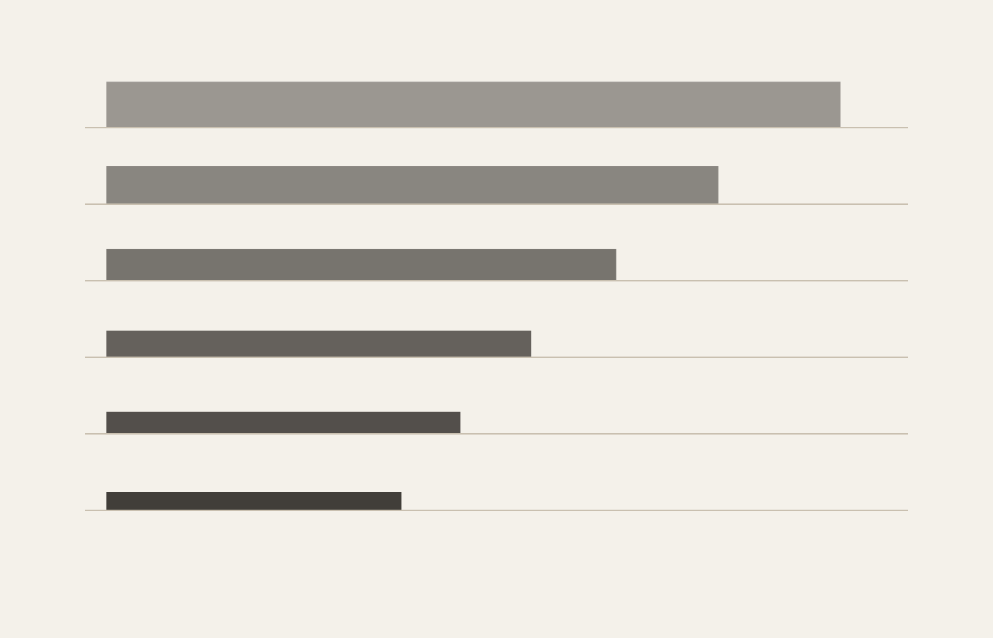
Nine roles, one ratio, and no size typed twice. Every measurement on the page comes from what a piece of text IS rather than from where it happens to sit, so one setting changes the whole page instead of one heading.
Türkçede i ve ı iki ayrı harftir, tıpkı o ile ö gibi. Yazılımın çoğu bunu bilmez, İstanbul’u ISTANBUL yapar, ve hatayı kimse bir veri tabanına yazılana kadar fark etmez.
Echte Kapitälchen sind gezeichnet: eigene Strichstärke, eigene Laufweite, eigene Höhe. Alles andere ist verkleinerte Versalschrift, wirkt dünn und zu eng — und genau das tut der Browser, wenn die Schrift den Schnitt nicht mitbringt.
Four horizontal marks that look alike, mean entirely different things, and are wrong on most pages on the web. A hyphen joins, an en dash spans, an em dash interrupts — and a minus sign is none of the three.
Trois mots français pour trois choses que l’anglais confond sous le seul mot spacing. La chasse appartient à la lettre, l’approche au couple, le gris à la page entière — et l’un ne corrige jamais l’autre.
A highlighter is a reading tool, not a decoration. Five pigments, and which one you reach for is a claim about why the sentence matters: a definition, a warning and a number all want different colours.
A scribe ruled the page before writing a word, and the ruling was arithmetic: nib widths in, line height out. Every margin on this site comes from the same calculation, done by a stylesheet instead of a lead point.
Blocksatz ohne Silbentrennung ist der häufigste Satzfehler im Web: Löcher, die sich über drei Zeilen zu einem Bach zusammenschließen. Zu beheben ist er in einer einzigen CSS-Zeile, die fast niemand hinschreibt.
Two adjacent colours will not line up perfectly, not on any press ever built. Trapping is deciding in advance which one loses, and rich black is the same decision made about the darkest thing on the page.
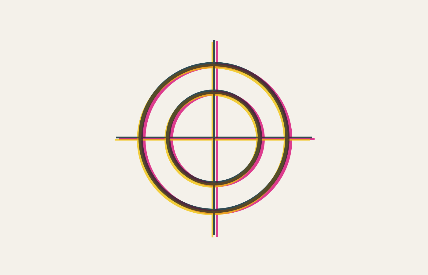
Four inks, four passes, and one of them a hair out of place. Everything you know about print colour — trapping, rich black, the fear of hairline type in three colours — follows from that single millimetre.
Three controls, three different jobs, and a great deal of type ruined by reaching for the wrong one. Kerning fixes a pair, tracking colours a paragraph, and letter-spacing is what you do to small caps and to nothing else.