The broad-edged pen, and what it still teaches
Nearly every serif on your screen is a frozen record of a flat nib held at an angle. Hold a pen at thirty degrees, write an O, and the thick and thin you get is the same modulation a type designer spends a year redrawing.
Pick up a broad-edged pen, hold it at thirty degrees, and write an o. The stroke is thick on the down-left and thin on the up-right, and you did nothing to make it so: the nib is a flat edge, and the width of the mark is simply how much of that edge is facing the direction you are travelling.
That single fact explains most of what a serif typeface looks like. The thick and thin of a Garamond, the axis its round letters lean on, the way the join between bowl and stem thins to nothing — none of it is decoration. It is a record of a tool.
The angle is the style
Hold the pen flatter and the contrast moves: you get the upright, heavy-footed look of an uncial. Hold it steeper and you approach the diagonal stress of an italic. Change nothing but the angle and the letterform changes family.
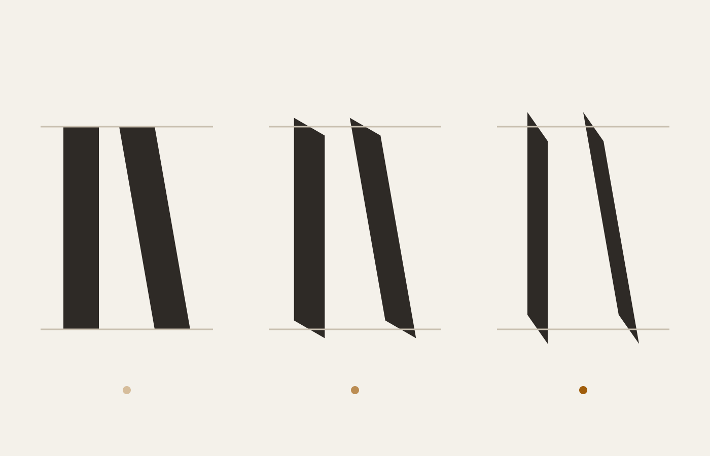
This is why type designers still learn to write with a pen even though nobody sets books with one. The pen teaches which parts of a letter are structural and which are habit.
One tool, four hands
The angle is not the only dial, but it is the master one. Hold everything else steady and walk the angle through history:
| Nib angle | Hand | Stress | Feel |
|---|---|---|---|
| 0–15° | Uncial | vertical | round, archaic, slow |
| 30° | Foundational, Carolingian | near-vertical | the workhorse |
| 40° | Chancery italic | diagonal | quick, warm |
| 45°+ | Gothic textura | strong diagonal | dense, woven |
Read the table downward and you are reading a thousand years of European writing, in order, as a single wrist rotation. Every row is also a typeface family you can name — which is the point: the families did not invent their stress, they inherited it.
What the pen cannot teach
It cannot teach spacing. A calligrapher spaces by feel, one letter at a time, and every line is different. A typeface has to space every possible pair in advance, forever, without knowing what will sit next to what.
That is the jump from writing to type, and it is a much larger jump than drawing the letters.
Trying it without any equipment
You do not need a nib to feel this. Tape two pencils together, hold them at a steady angle, and write your name slowly. The double line the points draw is the ribbon a broad edge lays down, and every widening and thinning arrives on its own, without a single decision from you.
Now rotate your grip a little and write the name again. The letters are recognisably yours and recognisably different — heavier here, leaner there — and you have just performed, in thirty seconds, the experiment that separates one historical hand from another.
Do it a third time faster and watch the joins start to slur. That slurring, disciplined over a few centuries, is where italic came from. The history of Western letterforms is substantially a history of people in a hurry, and the pen records the hurry as faithfully as it records the angle.