The reed pen, in Van Gogh’s letters
Over nine hundred of Van Gogh’s letters survive, and the famous ones are written with the same cut reed he drew with. They are the best free lesson in what a broad-edged tool does when nobody is performing: a working hand, at speed, on cheap paper.
Vincent van Gogh wrote more than nine hundred letters that survive, most of them to his brother Theo, and he wrote the Arles ones with the same instrument he was drawing with: a reed, cut to a broad edge with a pocket knife.1 Not a metaphorically similar instrument — the same pen, dipped in the same ink, moving between a sentence and a sketch without being put down.
That makes the letters something rare. Formal calligraphy shows you what a broad edge does when someone is being careful. The letters show what it does when someone is thinking about something else entirely — and the tool's behaviour survives the neglect, which is the whole argument for learning tools rather than styles.
A pen you make in a minute
A reed pen is the oldest broad-edged instrument there is: a length of dried reed, cut at an angle, slit once so it holds a drop of ink. Scribes wrote with it for two thousand years before the quill displaced it in Europe, and it never stopped being used where reeds grow — which includes the marshes around Arles.
Van Gogh cut his own, in several widths, and complained happily about them in the letters. The reed suited him for the reason it frustrates beginners: it holds little ink and gives it up fast, so every stroke starts wet and ends dry. A careful writer fights that. He harvested it — the fading stroke became texture, distance, wind in a field.
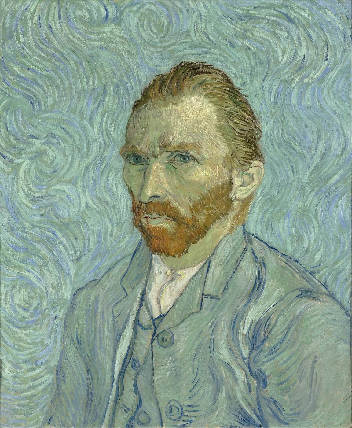
The floated portrait beside this paragraph is the size feature doing its job, incidentally: a figure at thirty per cent of the column, with the prose running around it, is how a magazine sets a face — and how a letter sets a sketch.
The page is composed, even when the words are not
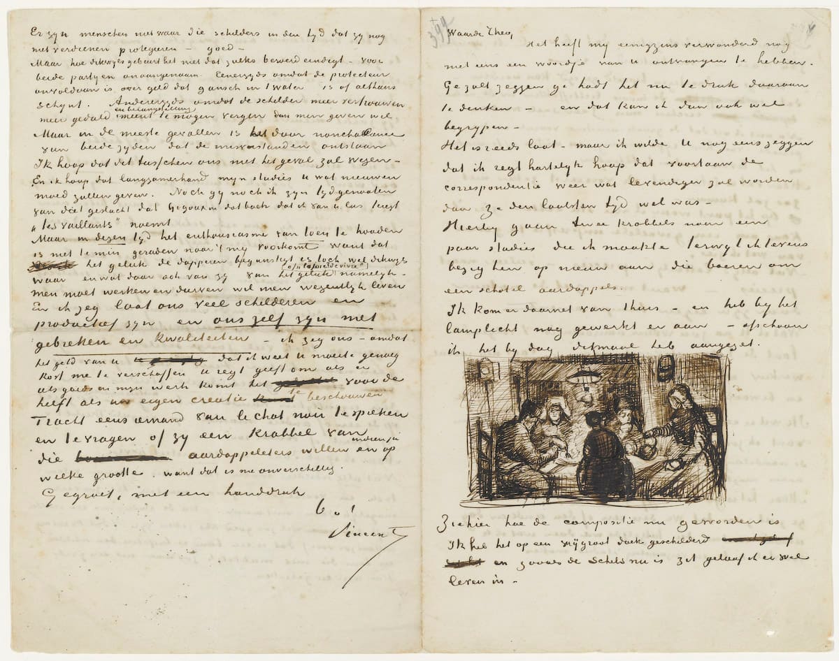
Look at the 1885 letter above rather than reading it — it is sitting on a mat, the way a facsimile is shown, which is a per-picture choice and not something done to the scan. The lines are dense and even, the left margin never wavers, and when a sketch arrives it is set into the measure like a figure in a book — The Potato Eaters, months before the painting, sitting between two paragraphs as if a compositor had placed it.
Nobody taught him that as a rule. It is what a person who looks at pages all day does by reflex, and it is the same reflex this software's figure placement is trying to give back to people who write on glass.
The sketch travels ahead of the painting
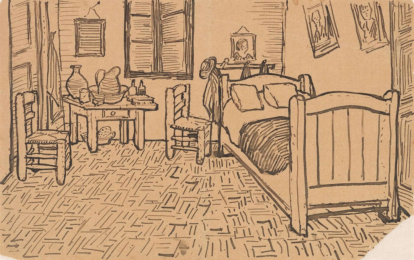
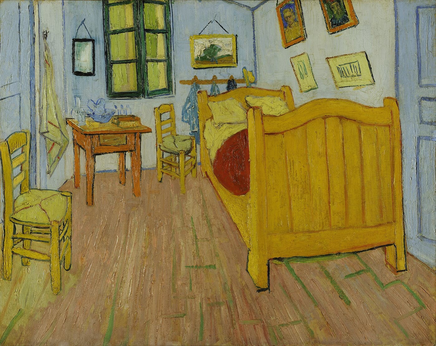
The bedroom drawing above went to Theo in October 1888, in the middle of a letter, days before the canvas was finished. The strokes are pure reed: the floorboards are single confident pulls that thin as the pen dries, the walls are hatched at one consistent angle, and every object keeps the wobble of a line drawn once and not corrected.
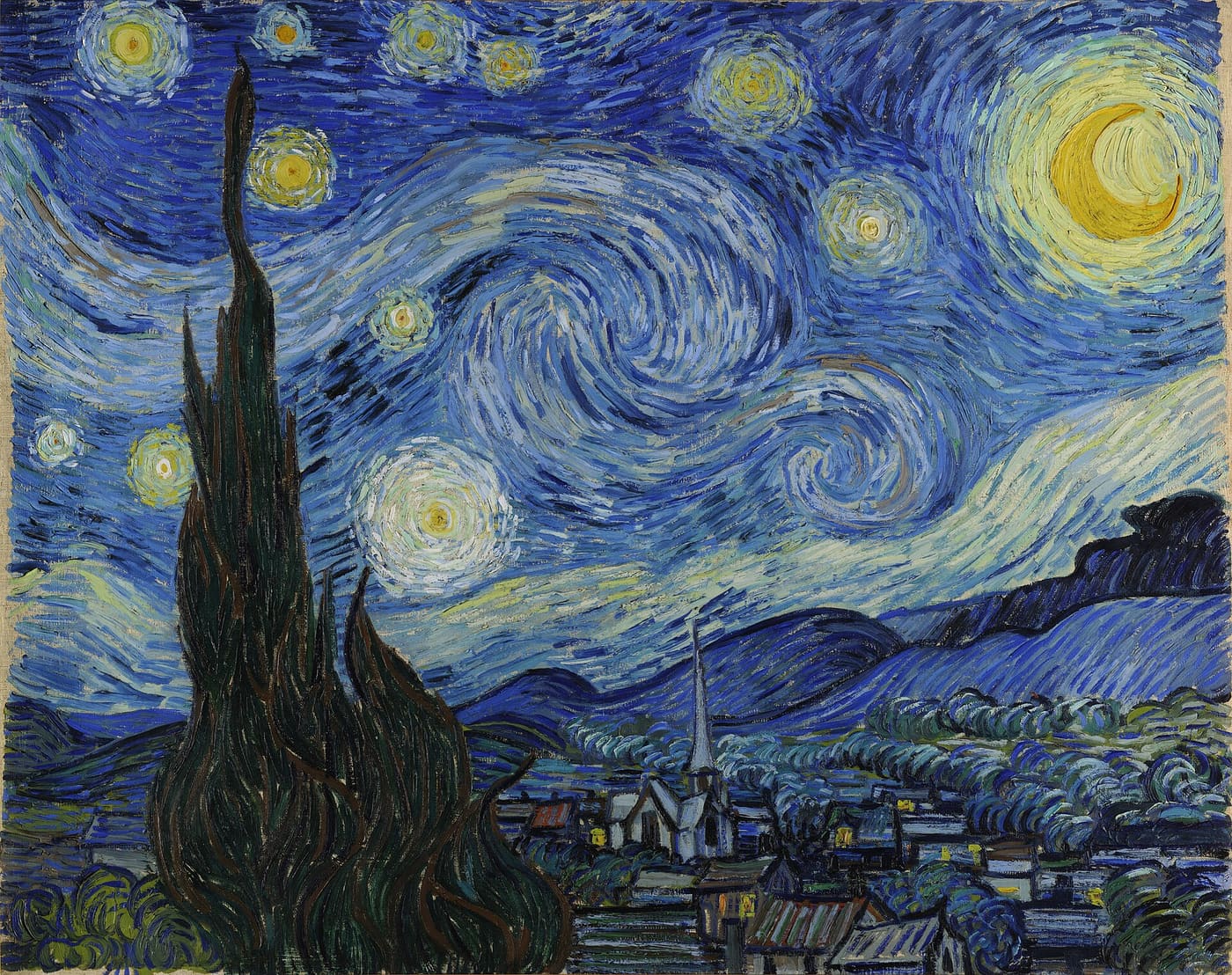
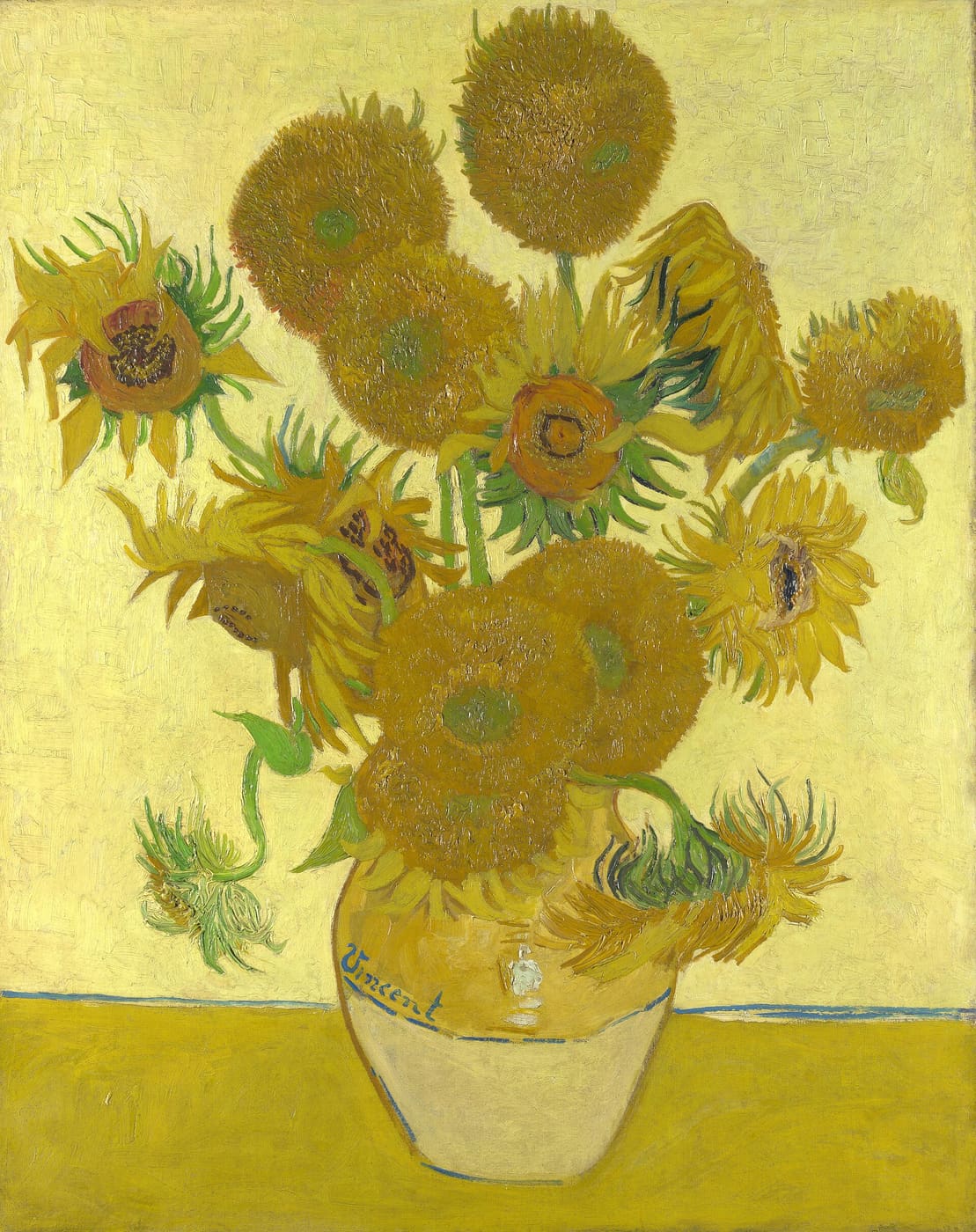
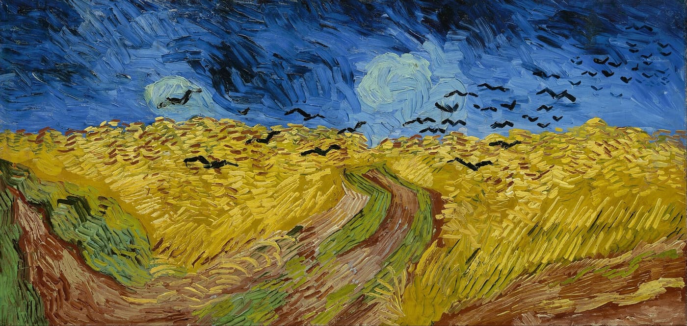
Put the paintings beside the letters and the pen is still visible under the paint. The same directional stroke, the same refusal to go back over a line — brushwork by a hand trained on a broad edge:
Three pens, one lesson
| Pen | Cut from | Ink held | The line it wants |
|---|---|---|---|
| Reed | cane, by hand | a drop | short, emphatic, drying |
| Quill | a flight feather | a sentence | long, flexible, fine |
| Steel nib | pressed metal | a paragraph | uniform, tireless |
The table explains the letters' texture better than any stylistic analysis. A quill hand flows because the tool flows; a reed hand punches because the tool runs out. Choose the tool and you have chosen most of the style — which is the first lesson of the broad-edged pen, arriving here from a man who would have been baffled to be called a calligrapher.
Tip
The letters are online, free, in facsimile with transcriptions — the Van Gogh Museum's edition at vangoghletters.org. Read one in facsimile before reading it in type. The typeset version tells you what he said; the page tells you how he worked.
- The surviving correspondence runs to 902 letters in the Van Gogh Museum's critical edition, around 820 of them from Vincent. The Arles letters increasingly carry reed-pen sketches; he mentions cutting the reeds himself in the spring of 1888. ↩