Registration, and the millimetre that ruins a spread
Four inks, four passes, and one of them a hair out of place. Everything you know about print colour — trapping, rich black, the fear of hairline type in three colours — follows from that single millimetre.
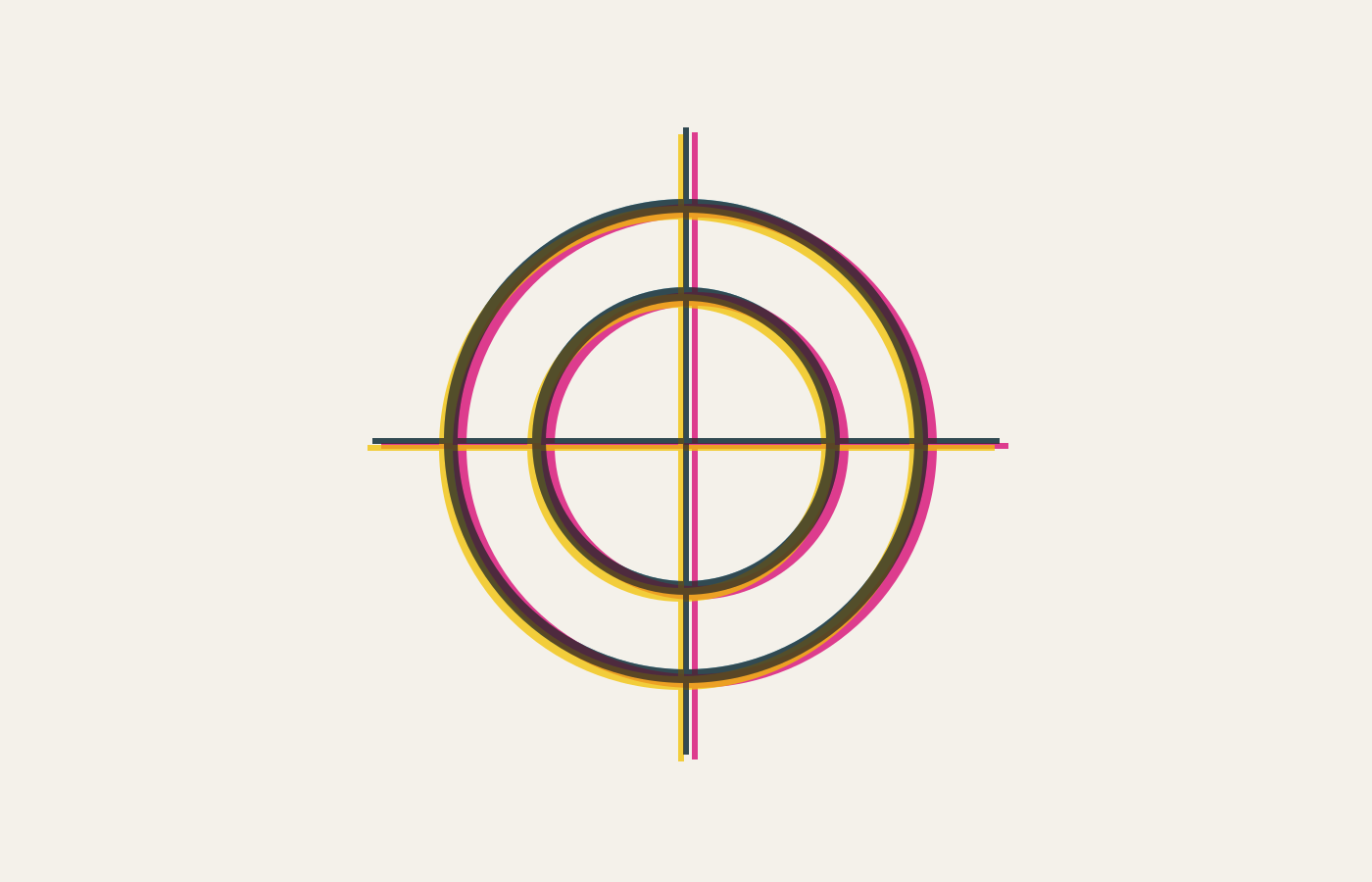
A colour page is printed four times: cyan, magenta, yellow, black, one after another. Registration is how precisely those four passes line up, and a misregistration of a fraction of a millimetre is visible to anyone, even people who could not name what they are seeing.
The tell is a coloured fringe along a hard edge. Black text on a white ground survives it, because black text is usually printed in black ink alone. Reversed text — white type knocked out of a coloured panel — does not, because now the edge of every letter is the boundary between four separate impressions.
Why small reversed type is a trap
At small sizes the stems are thinner than the registration tolerance of the press. The letters close up, fill in, or acquire a coloured halo. A design that looked crisp on screen arrives as mud, and no amount of arguing with the printer fixes it.
Rich black, and knowing when not to
The arithmetic is unforgiving. A press holding registration to on each of two plates can put them out by in the worst case, so a stem of width survives only while
At — good commercial work — that is a floor of a tenth of a millimetre, which is a hairline serif at about six point. Below it the letter does not look thin, it looks coloured.
Solid black on a large area looks weak in plain black ink, so printers mix in some cyan to deepen it. That is rich black, and it is right for a filled panel. It is wrong for text, because now the text has two inks to register and you are back to fringed edges.
Plain black for type, rich black for areas. That one rule prevents most print colour disasters, and it is older than any of the software involved.