Ink, paper, and the colour between them
A palette is two decisions: what the ink is, and what it sits on. Everything else is adjustment, which is why one hex value can read warm on a cream page and dirty on a white one.
Printers did not have palettes. They had an ink and a stock, and everything they could do with colour lived in the relationship between those two.
That constraint produced better-looking pages than most colour pickers do, because it forced the only two decisions that matter to be made first and deliberately.
Paper is a colour
Uncoated paper is not white. It is warm, faintly yellow, and it absorbs ink so the same black reads softer than it does on a coated sheet. Choosing the stock sets the highlight of everything printed on it, which means it sets the contrast of the whole book before a single word is placed.
Ink is rarely black
Trade books are commonly printed in a black that has been warmed slightly, because a neutral black on a warm sheet looks like a hole. The adjustment is small enough that no reader would name it and large enough that every reader feels it.
A painter ran the same experiment
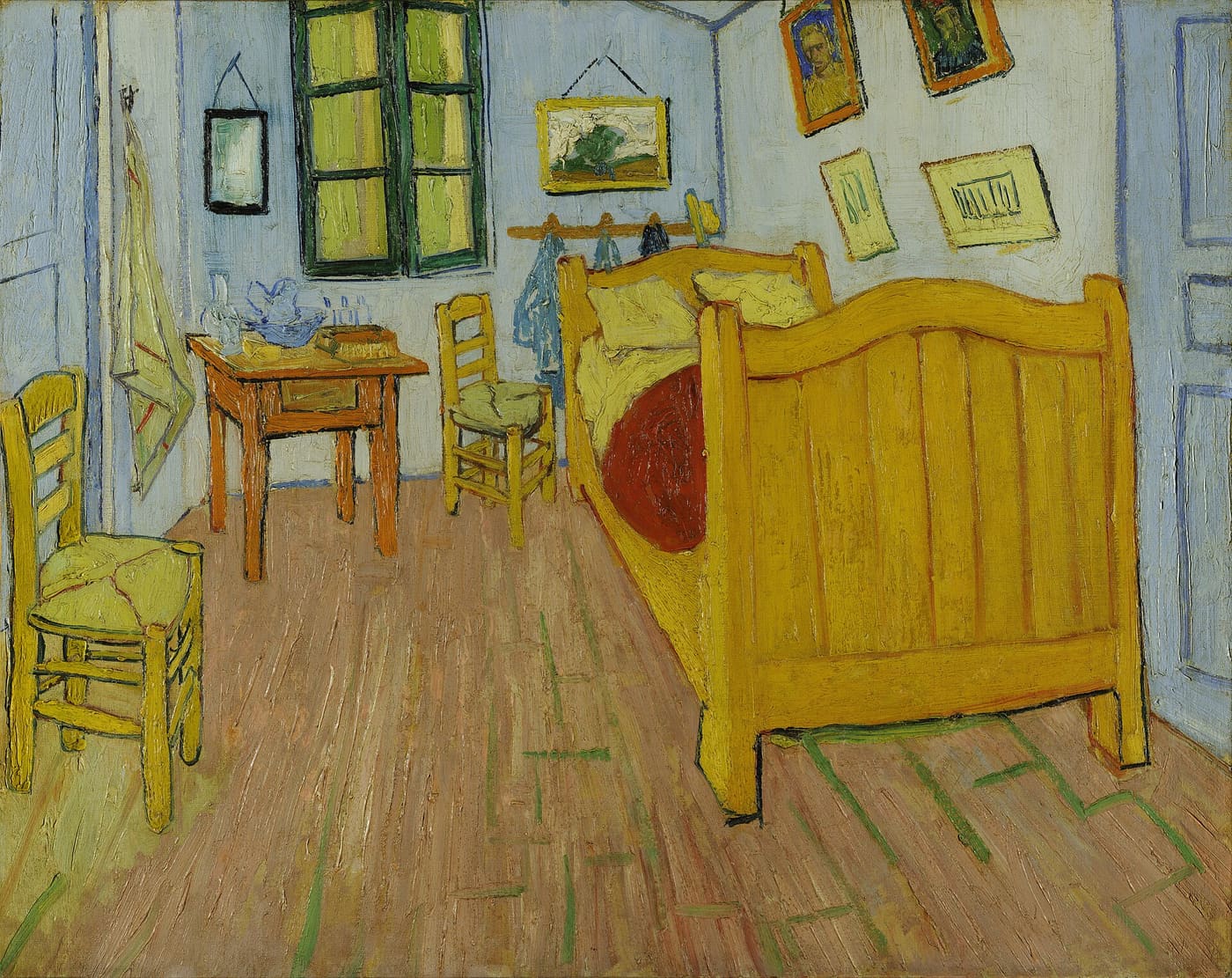
The painting beside this paragraph is the ink-and-stock decision made with oil paint. Van Gogh primed the canvas pale and then, as he wrote to Theo while working on it, pushed every colour to do the room's work — the walls violet, the floor a broken red, the furniture "the yellow of fresh butter" — each one chosen against that ground, not against a colour chart.
Swap the ground and the picture dies. That is not a metaphor for the printer's problem; it is the identical problem, one layer up. The stock is the ground, the ink is the pigment, and no swatch means anything until it is lying on the surface it will live on.
Translating the idea to a screen
A screen palette that begins from "what is the paper, what is the ink" produces calmer pages than one that begins from a brand colour. Set the background and the text colour first, and let the accent be the third decision rather than the first.
That is also the reason a good reading theme has so few colours in it. There were only ever two.