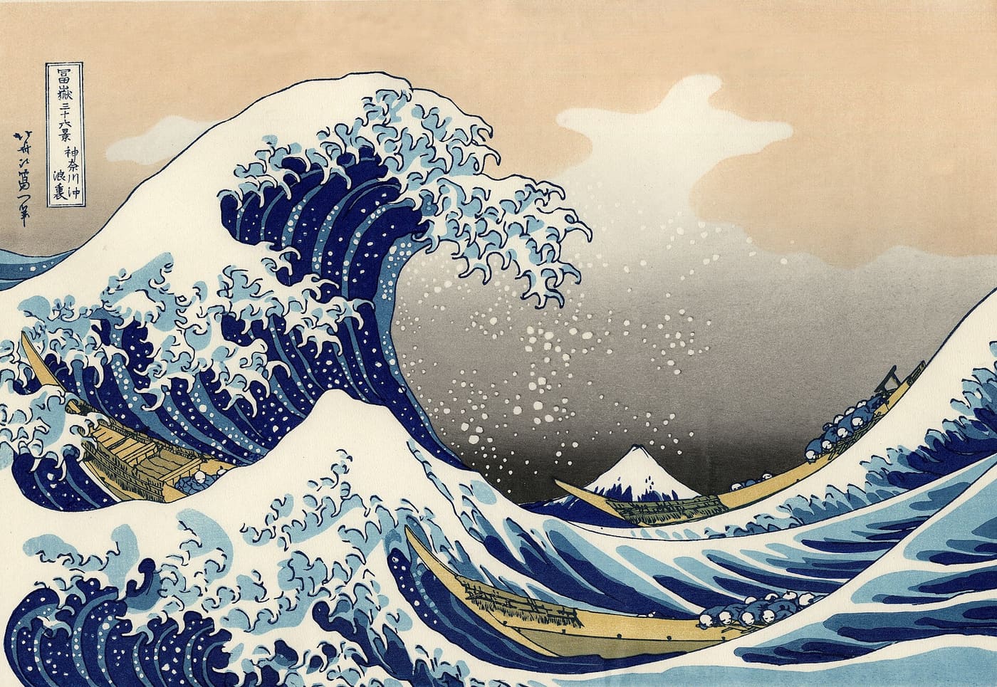
The Great Wave is not a painting. It is a print run — four trades, a dozen blocks, and a registration system made of two notches in the wood. Everything this series has said about presses, Edo said first with cherry planks.
A highlighter is a reading tool, not a decoration. Five pigments, and which one you reach for is a claim about why the sentence matters: a definition, a warning and a number all want different colours.
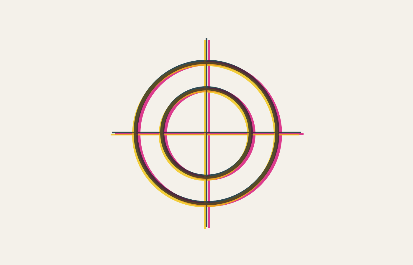
Two adjacent colours will not line up perfectly, not on any press ever built. Trapping is deciding in advance which one loses, and rich black is the same decision made about the darkest thing on the page.
Four inks, four passes, and one of them a hair out of place. Everything you know about print colour — trapping, rich black, the fear of hairline type in three colours — follows from that single millimetre.
A palette is two decisions: what the ink is, and what it sits on. Everything else is adjustment, which is why one hex value can read warm on a cream page and dirty on a white one.